
/Web
/Twindom
Twindom is a startup that scans and prints 3D miniatures of people. During my internship with them, I was in charge of redesigning the Twindom website.
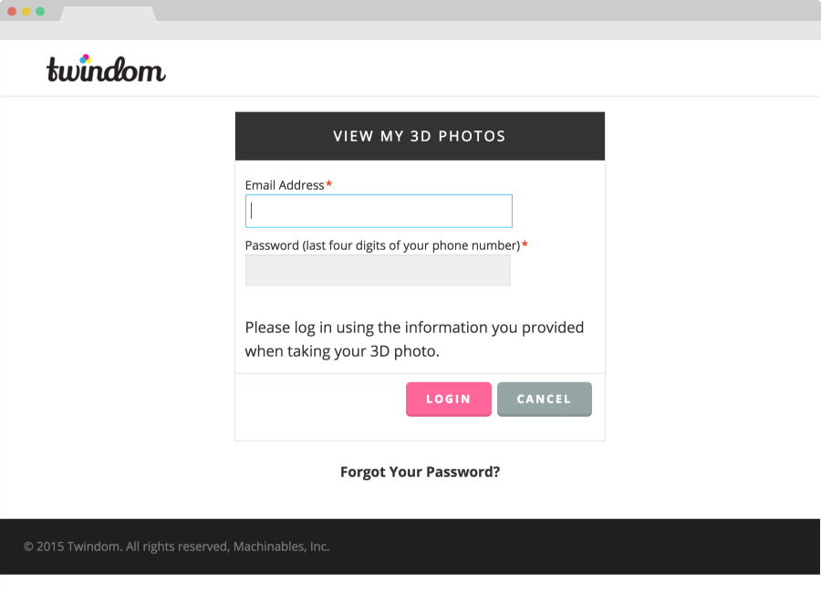
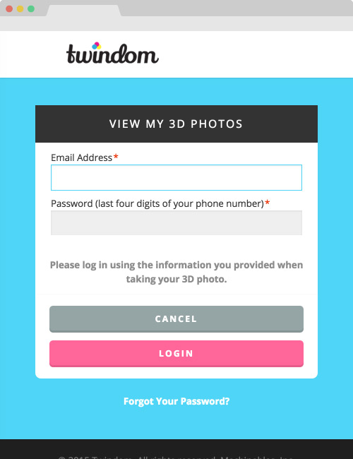
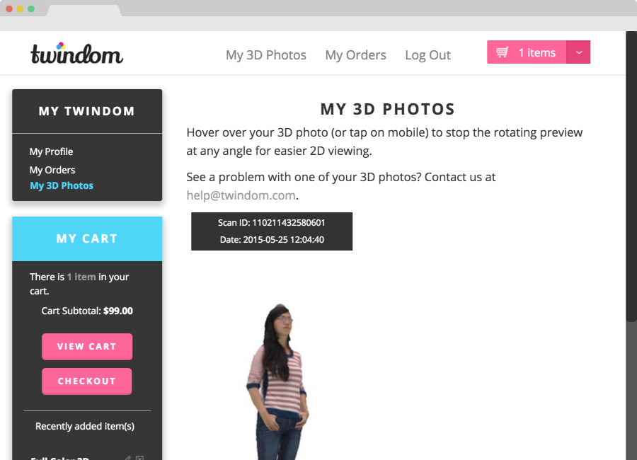
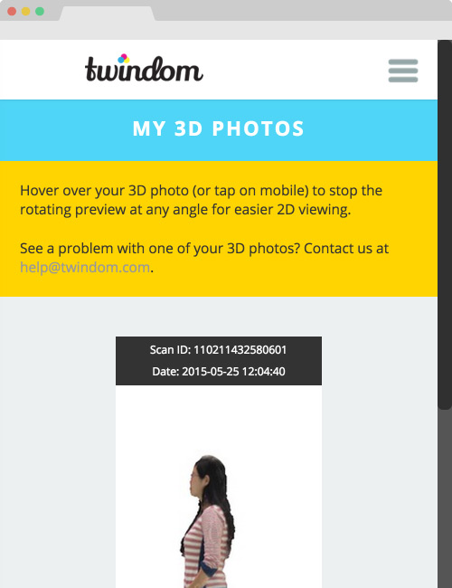
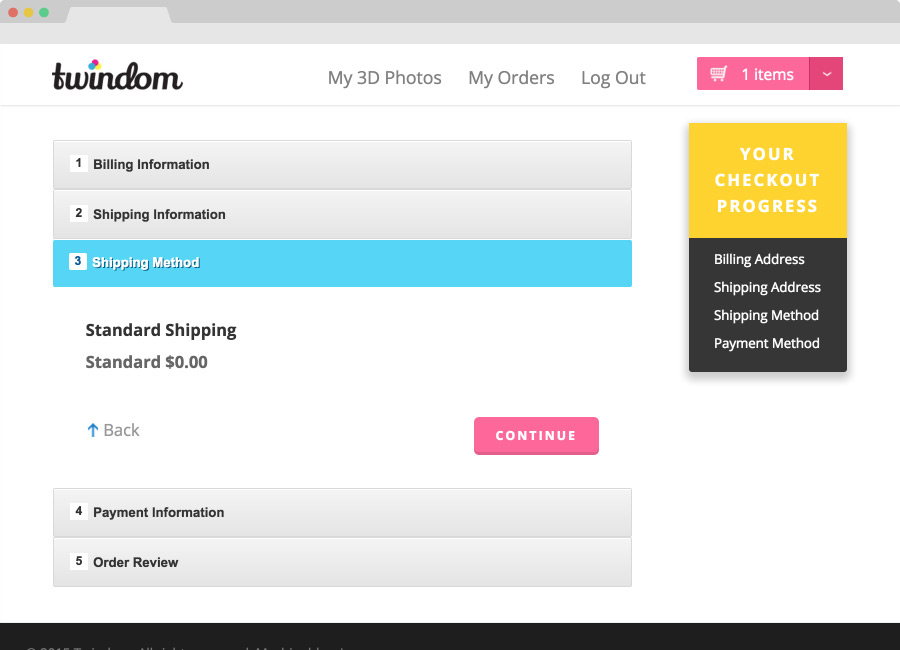
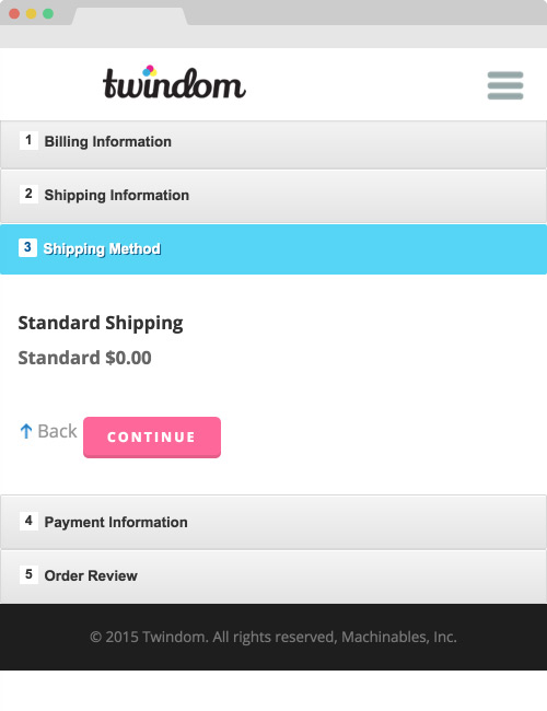
One of my first priorities was making the site more mobile-friendly. I focused on making the mobile layouts glanceable, especially through the use of color to block out information.
In addition, I worked on many other aspects of the site, including the site flow, icons, other graphic assets, and overall look-and-feel.
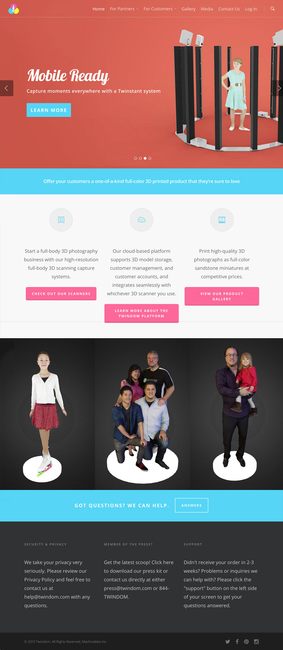
/01 Flow
Previously, the site’s layout made it difficult for potential Twindom partners to find information about the company’s scanners, platform, and other services. The site’s focus on individual scanning and printing obscured content that was useful for partners.
The new site flow guides visitors onto one of two tracks: Partner or Customer. This reorganization enables visitors to easily find whatever information they’re looking for. In line with Twindom’s new focus on providing services to partners rather than individuals, I prioritized partner-focused content on the front page, including images and text.
/02 Header
New banner images quickly catch visitors’ attention. I replaced images of printed miniatures with 3d renders and scanners to reflect Twindom’s move away from 3d-printing.
/03 Icons
I replaced the site’s old free icons with custom-designed icons.
/04 Graphics
I created all of the new graphic assets necessary for the rebuilding of Twindom.com, including banner images, 3d renders, icons, and other assets. I also implemented several completely new pages, including a media page and a 3d-scanners page.
/05 Color
I chose and used bright, bold colors consistently throughout the site to create a fresh look and feel. I also used color to enhance the site’s ease-of-use; for example, pink is consistently used for buttons, signifying clickability to the user.